CENTRAL CITY APARTMENT, AUCKLAND
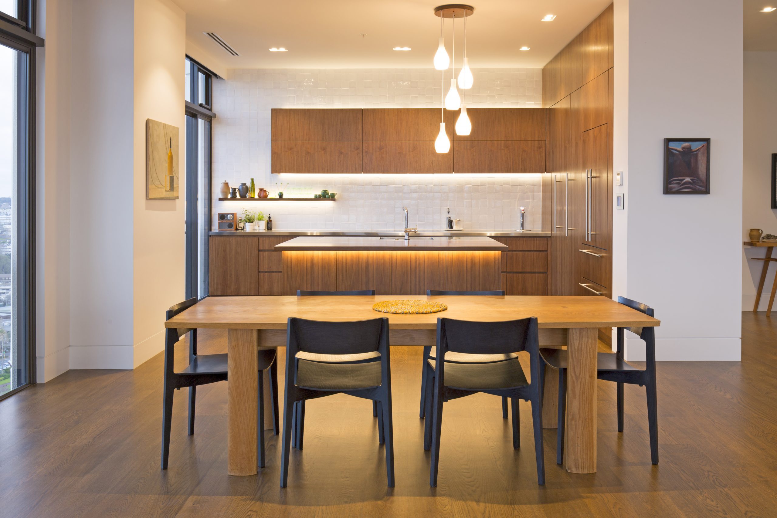
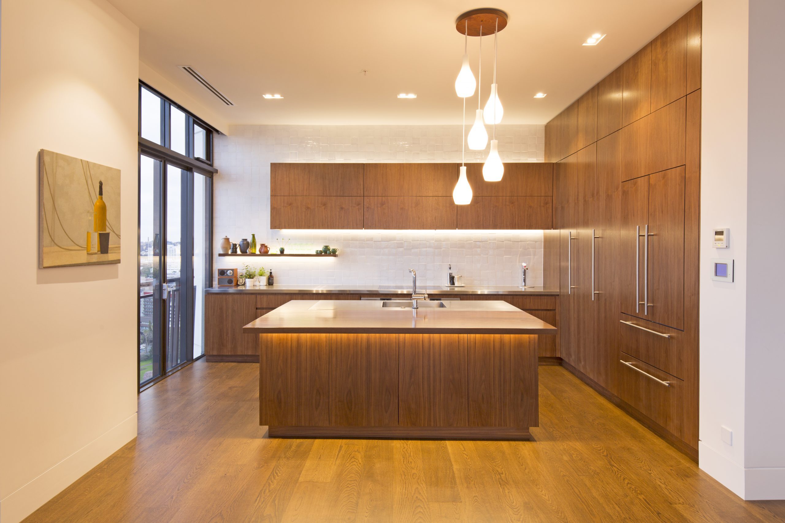
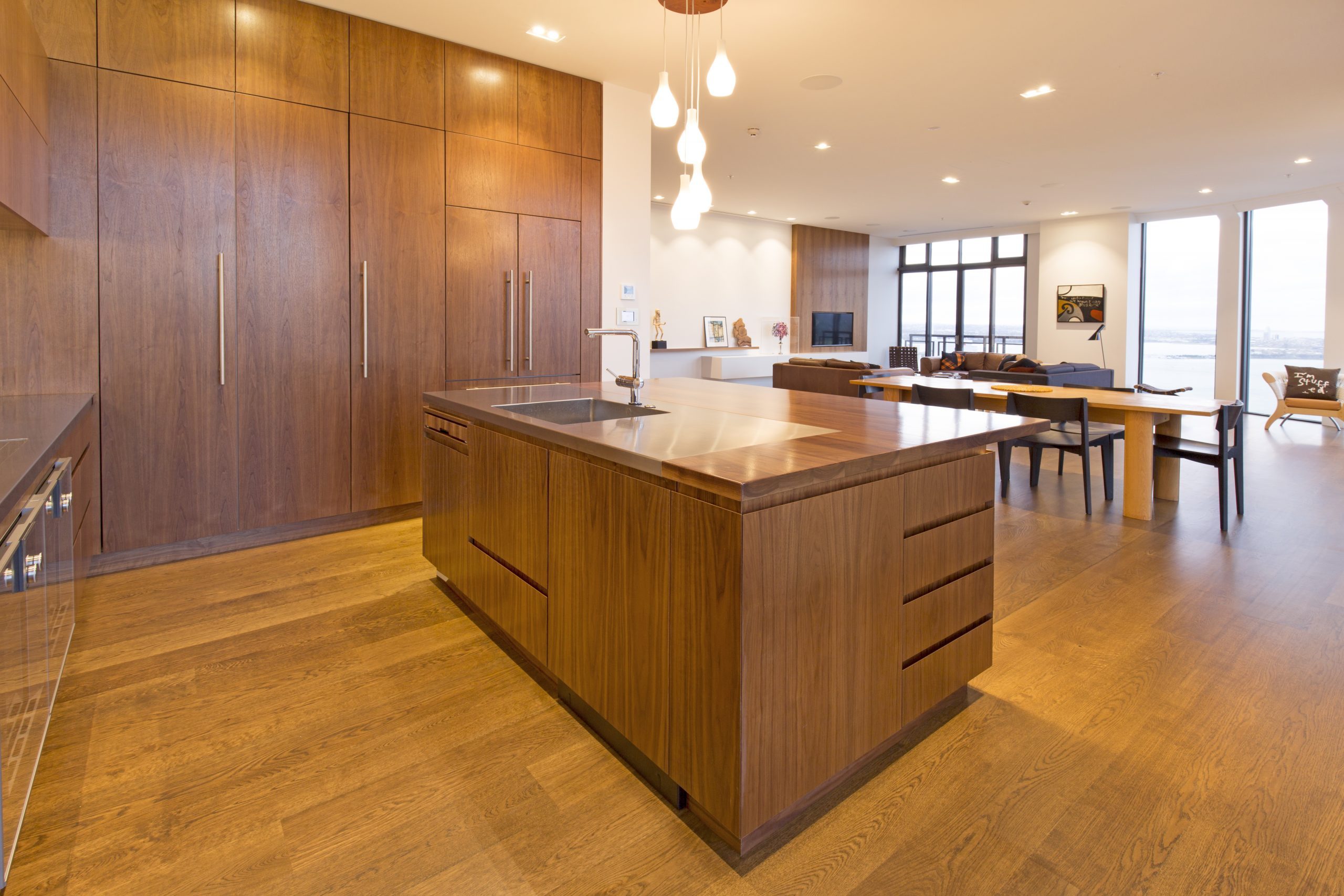
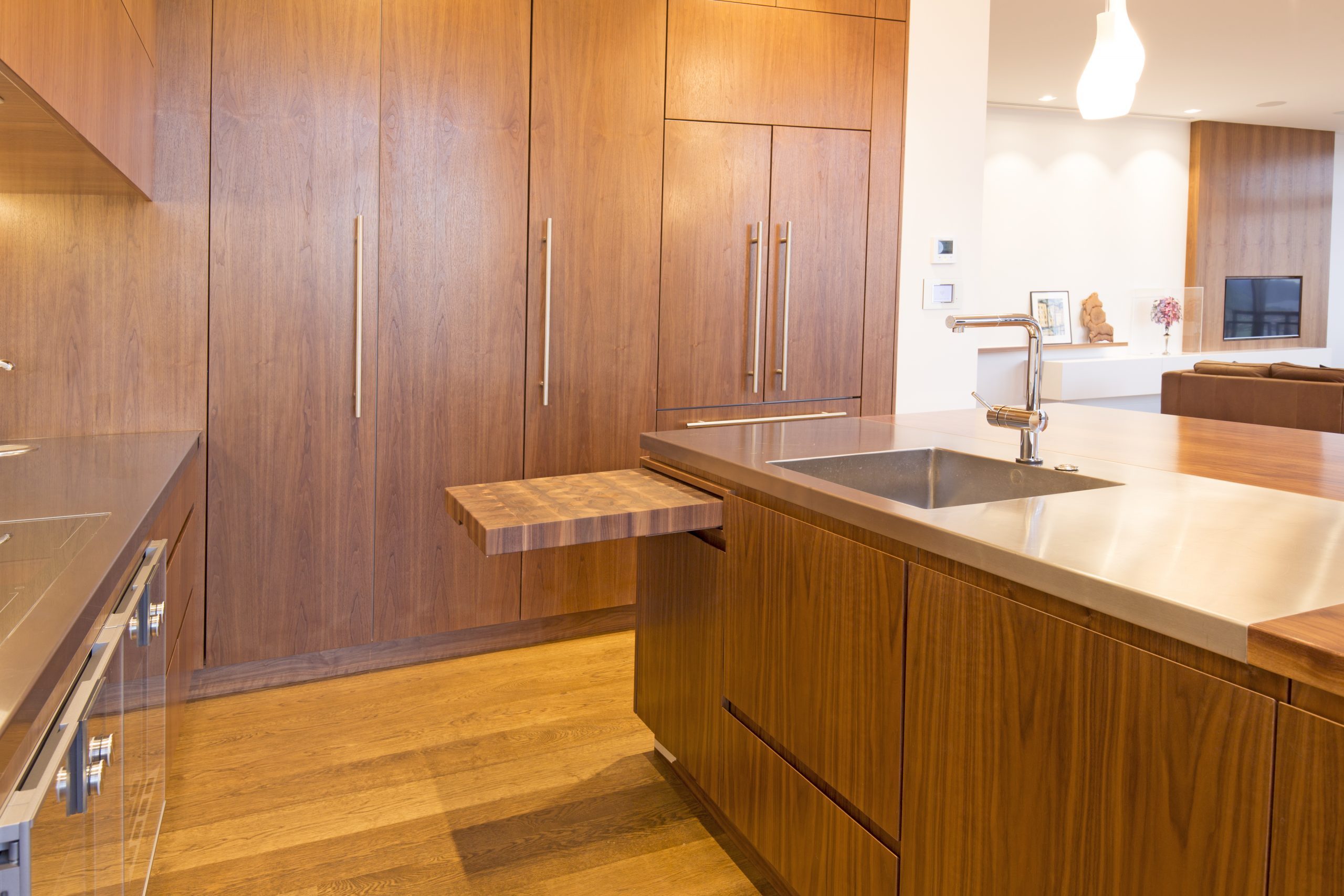
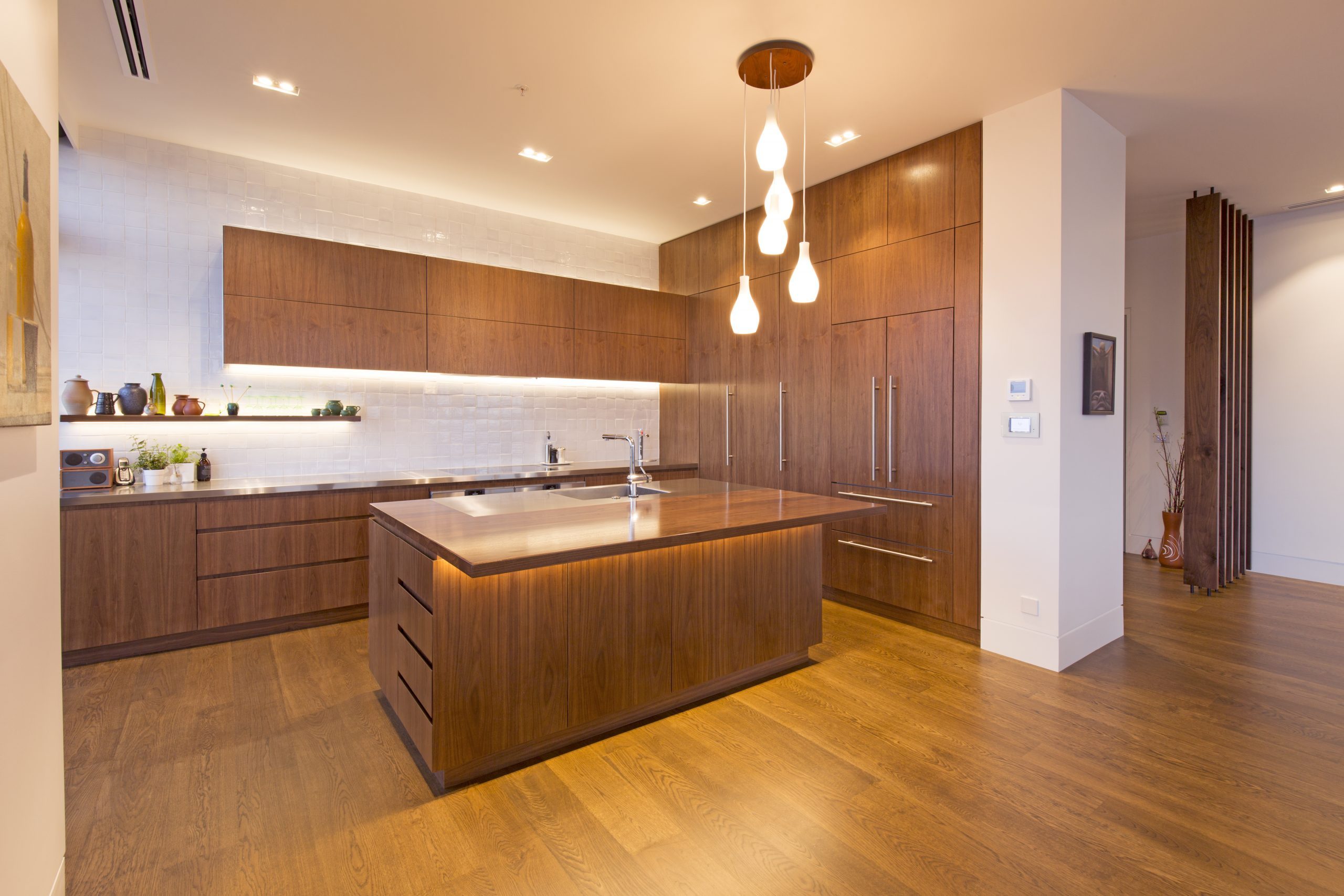
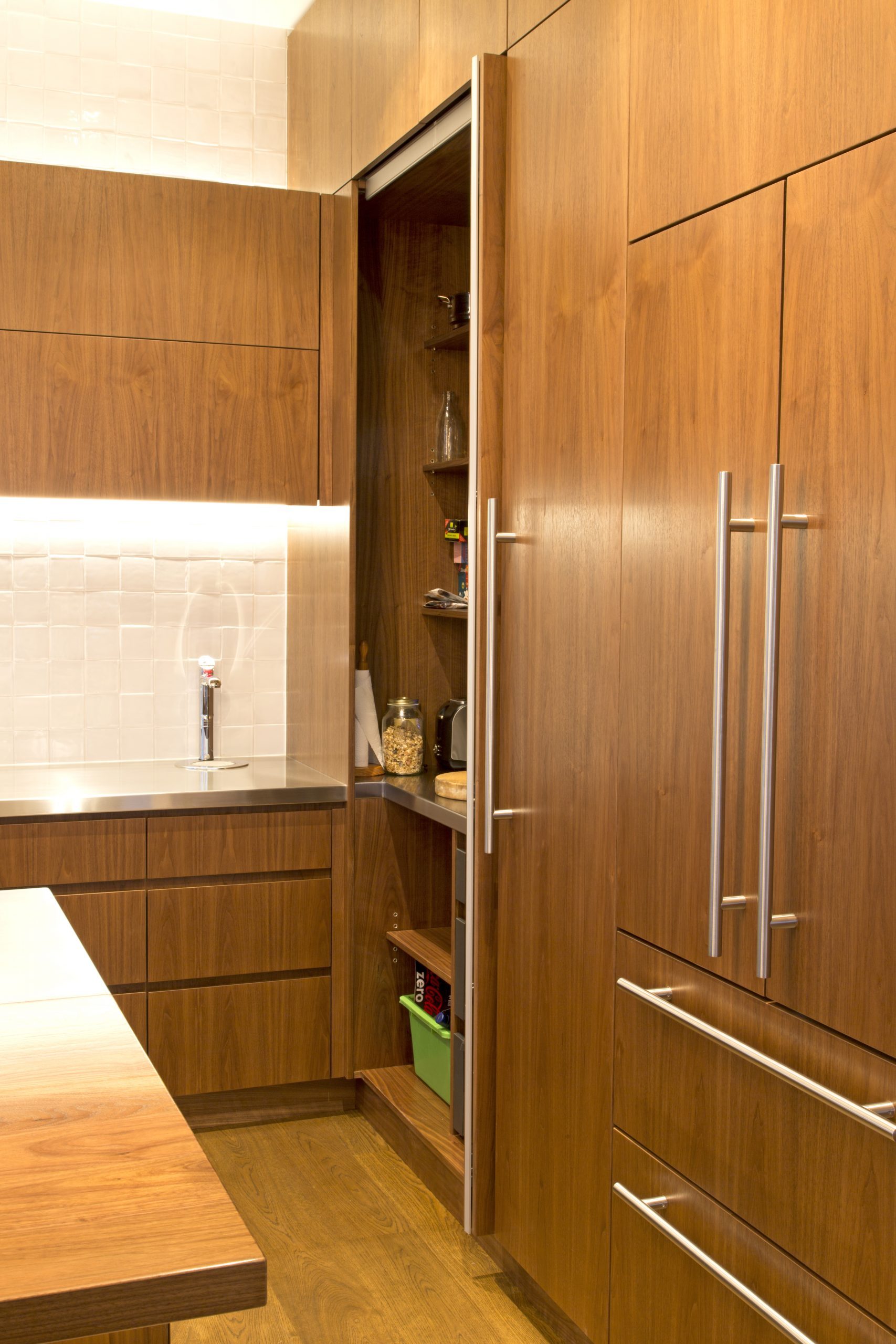
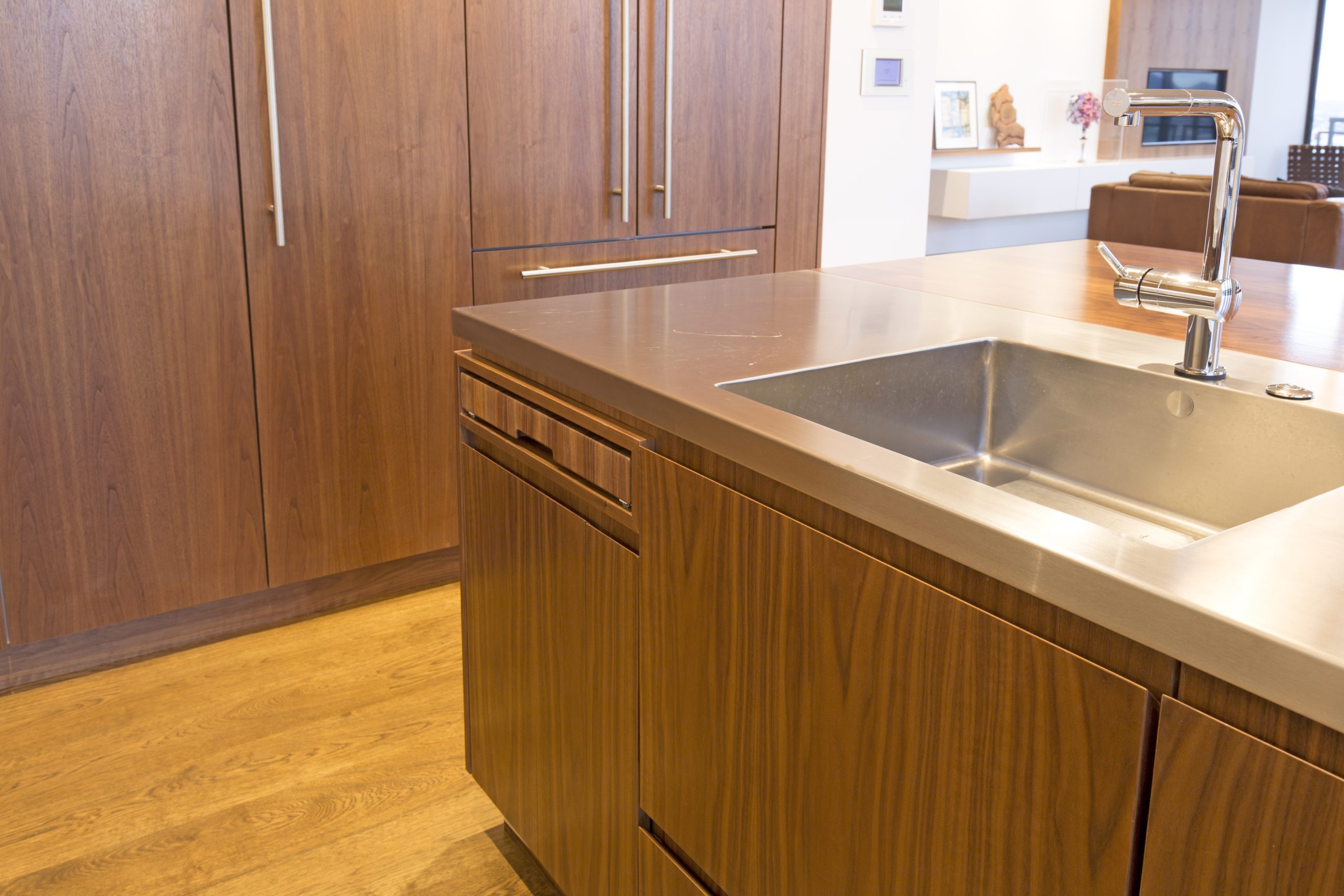
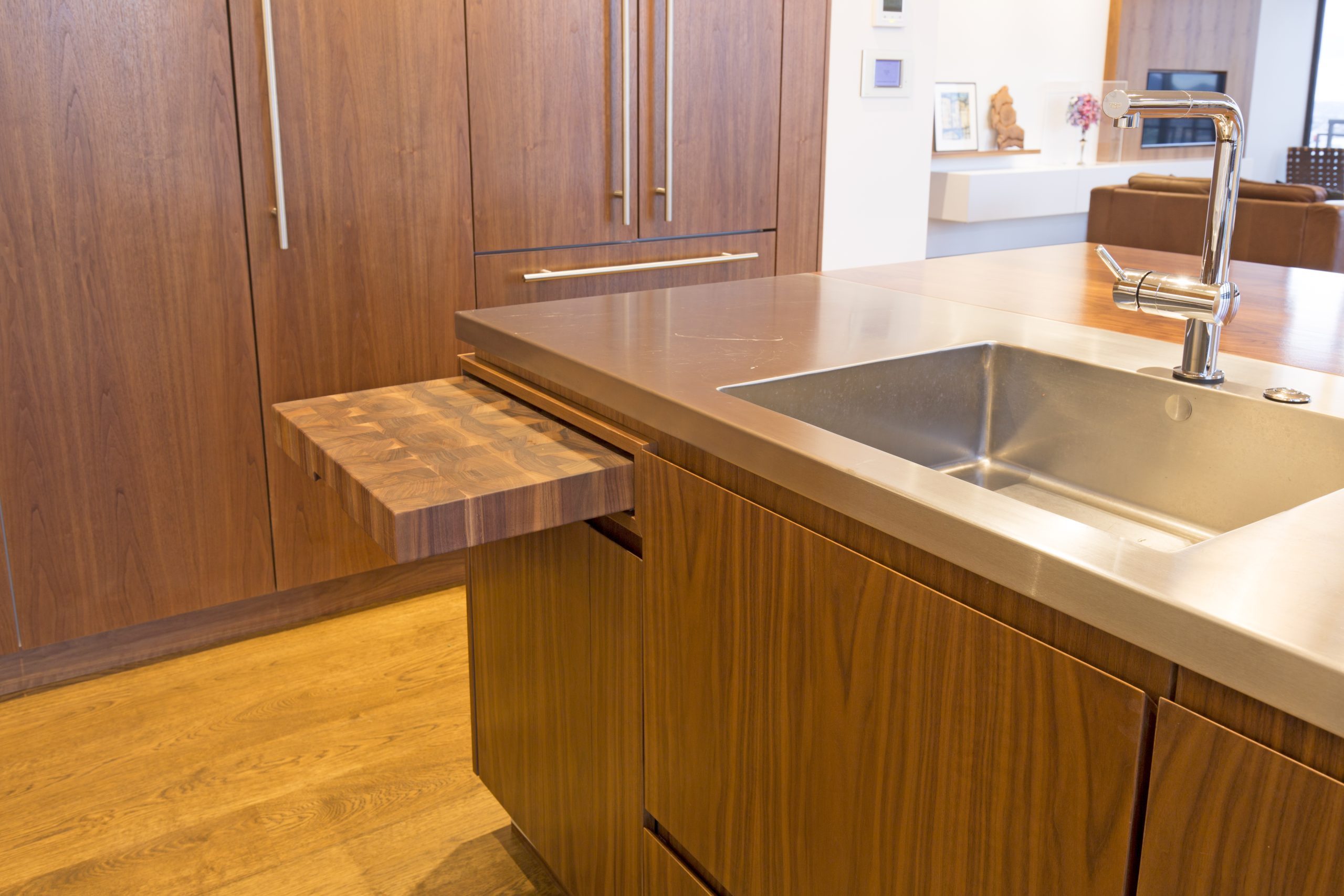
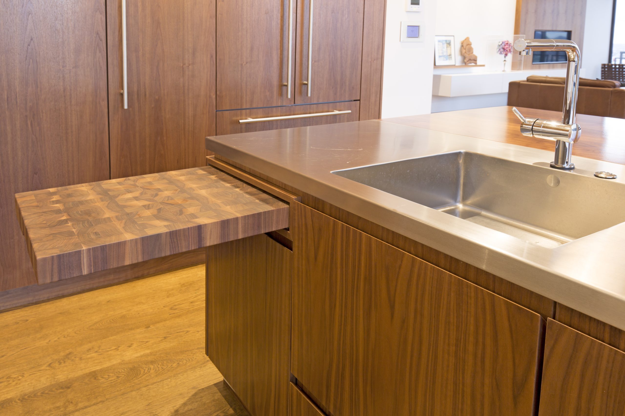
At 37 stories in the sky, you are drawn to the uninterrupted views over central Auckland. As you enter the apartment the solid timber fins define the open entry. The kitchen wanted to be functional and inviting, and to sit comfortably within the 3.6m stud open-plan living space.
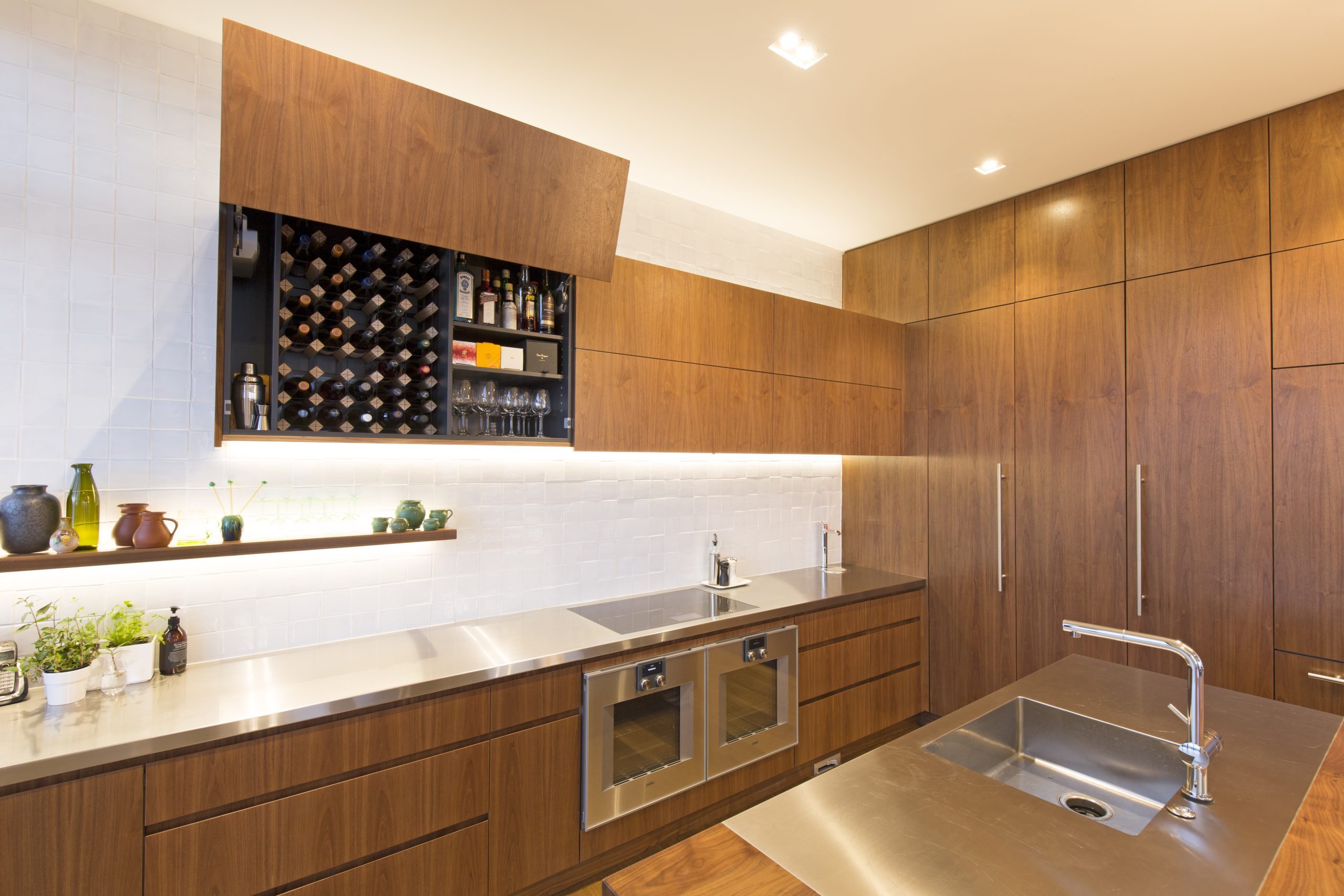
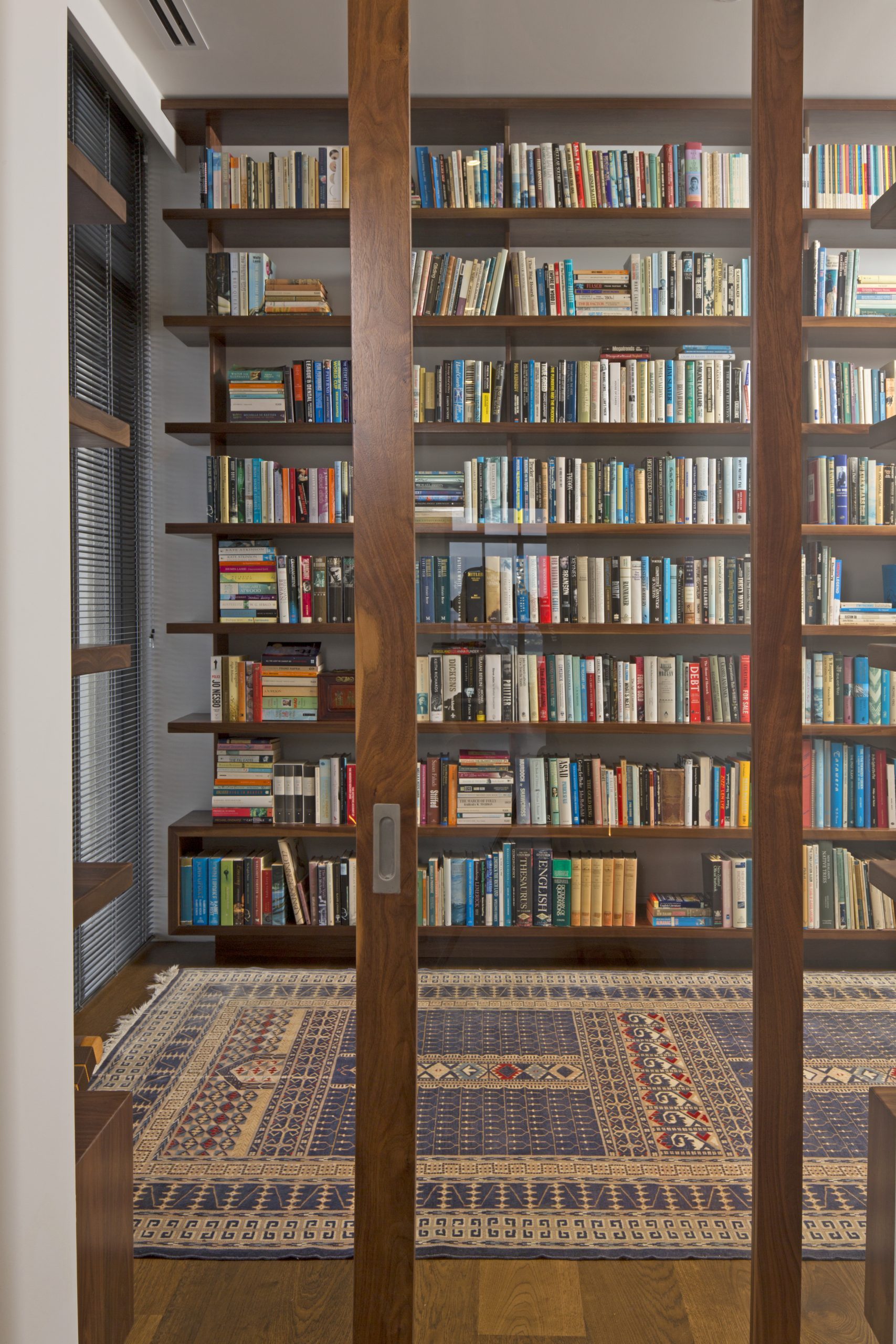
The client had a clear aesthetic in mind which accommodated the use of some treasured fittings saved from a childhood family home; the floating shelving provides an opportunity to display these special pieces and add some colour. The 100 x 100 full-height tiles complement the modern 70s aesthetic and add texture to the two-tone kitchen. Down the hallway you are drawn through a custom walnut door to the impressive library, with solid walnut floating shelving featuring a custom movable ladder to allow full access to the space.
DESIGNER: GEMMA MILLS
CABINETRY: FLUID INTERIORS. KITCHEN + LIBRARY + ENTERTAINMENT + VANITIES + ENTRY FINS (LAUNDRY + MASTER ROBE)
BENCHTOPS: STAINLESS STEEL SATIN FINISH
BREAKFAST BAR + FLOATING SHELVING: CUSTOM SOLID WALNUT WITH RESIN FINISH
CABINETRY: AMERICAN WALNUT VENEER CROWN CUT STAINED
LOCATION: CENTRAL CITY, AUCKLAND
DATE: 2015
PHOTOGRAPHY: TONY GATMAN
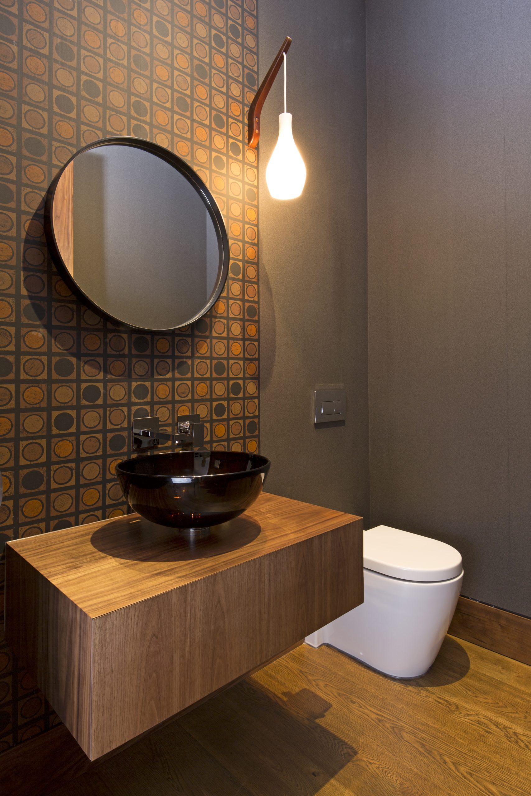
HERNE BAY, AUCKLAND
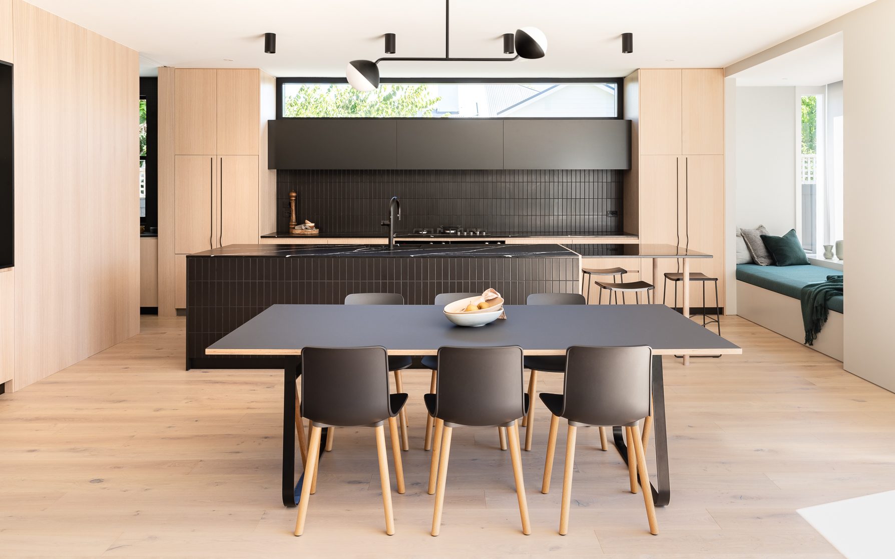
In collaboration with the interior designers from at.space, The Building Co team and the client, Fluid Interiors undertook this Herne Bay renovation to detail, manufacture and install the high end cabinetry throughout the character villa.
The project encompasses a contemporary design, featuring a palette of natural American Oak veneer, black, warm pinks and greys and deep navy blue throughout.
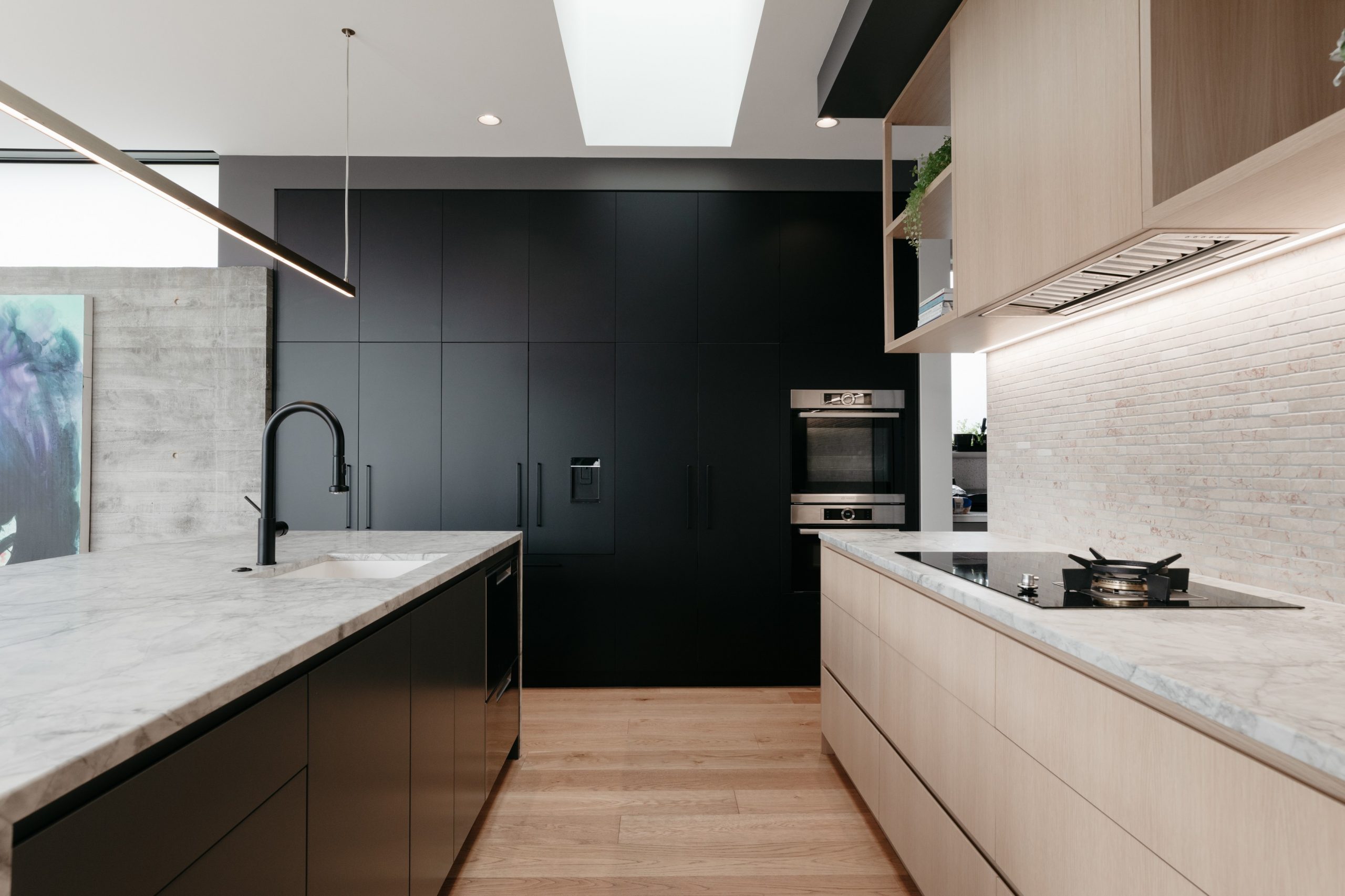
WESTMERE, AUCKLAND
The inspiration for this kitchen design came from commercial spaces our clients had seen, as well as hotels, bars and restaurants they had visited. The kitchen has modern clean lines and a steel-framed glass scullery. The greenery in the custom-made shelving above the breakfast bar softens the lines of the American oak cabinetry and granite benchtop.
Another special feature is the undercover outdoor area. The cabinetry, cleverly crafted from the home’s rough sawn cedar exterior cladding, blends seamlessly into its surroundings. It neatly conceals a wine fridge, bins, and storage for wine glasses, towels, and rugs.
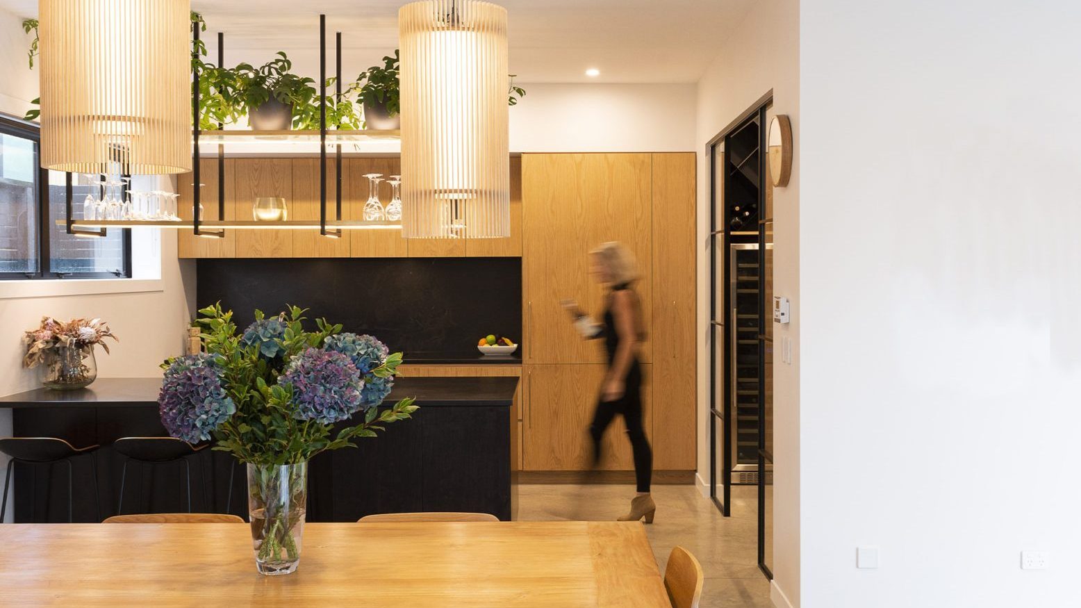
MT EDEN, AUCKLAND
Working closely with interior designers at.space and the building team at The Building Co, Fluid Interiors detailed, manufactured and installed the custom cabinetry and veneer panelling throughout this character-filled villa.
The kitchen and bar combine warm oak veneer cabinetry with contrasting black stone and steel tops, which blend seamlessly with the veneer-panelled walls.
The overall design features pops of blue hues throughout, from the custom teal cabinetry in the scullery to the handles on the matt-black TV unit. Our team is proud to have played its part in creating this beautiful and thoughtfully designed home.
